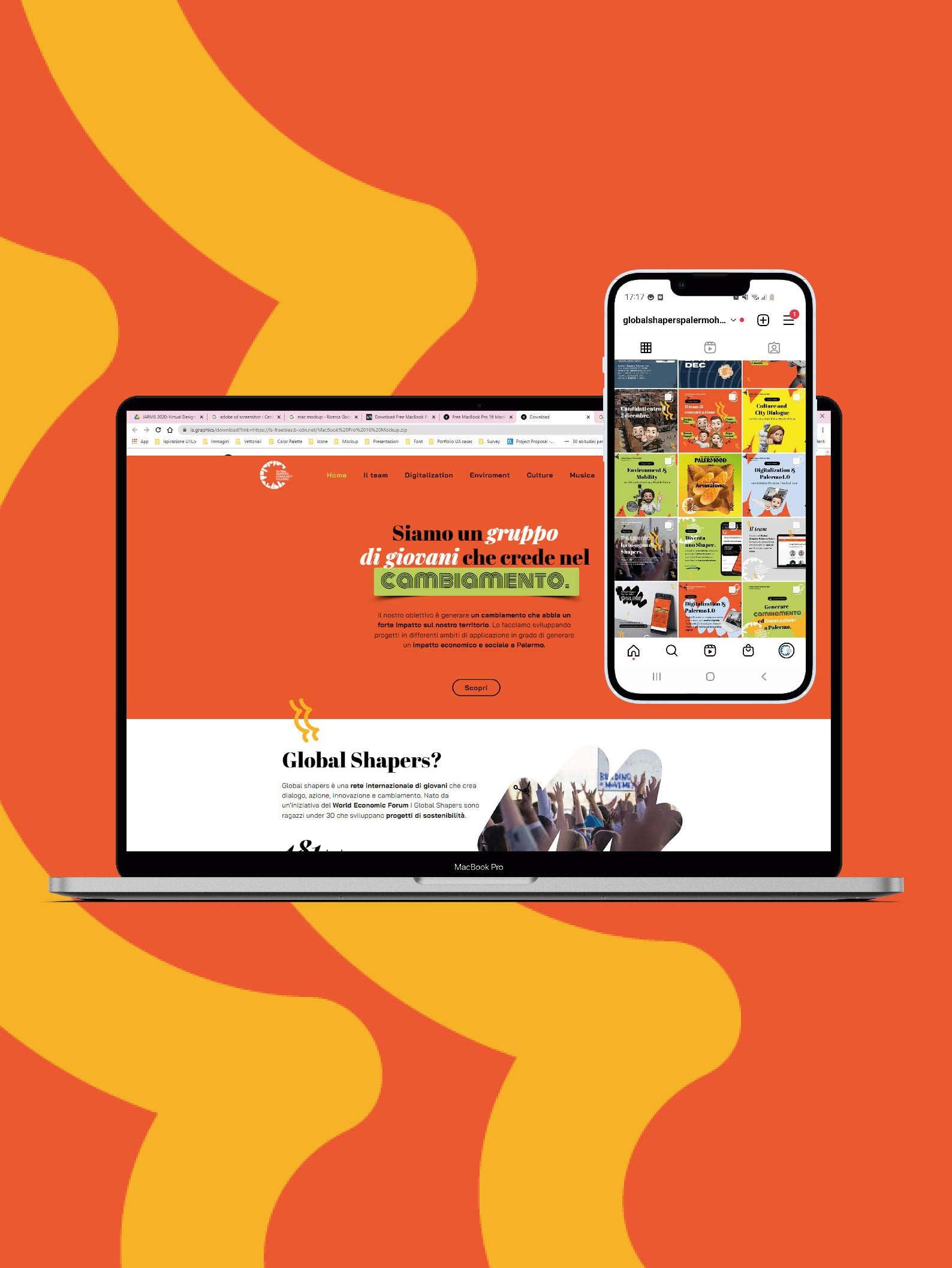
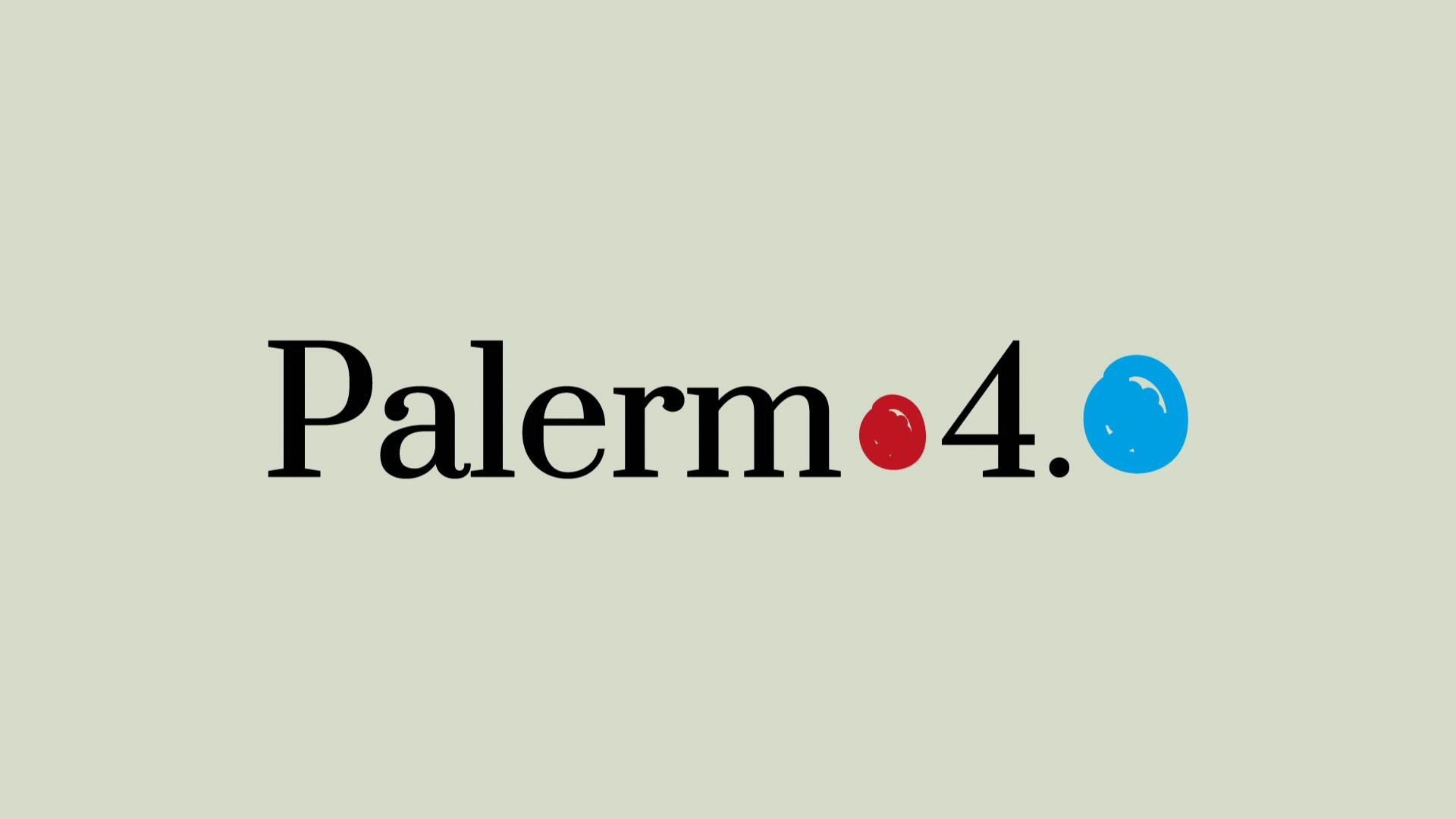
Logo and Branding image of the event digital workshop.
Brief
The project's aim is to empower the work tissue of the city. Indeed the network contributes to making relations between entities and people. The students can take advantage of the network, knowing and developing new skills needed for the market of jobs in the city. In this way, the identity should have been easy and near the concept of school, at the same time strong and recognizable.
Execution
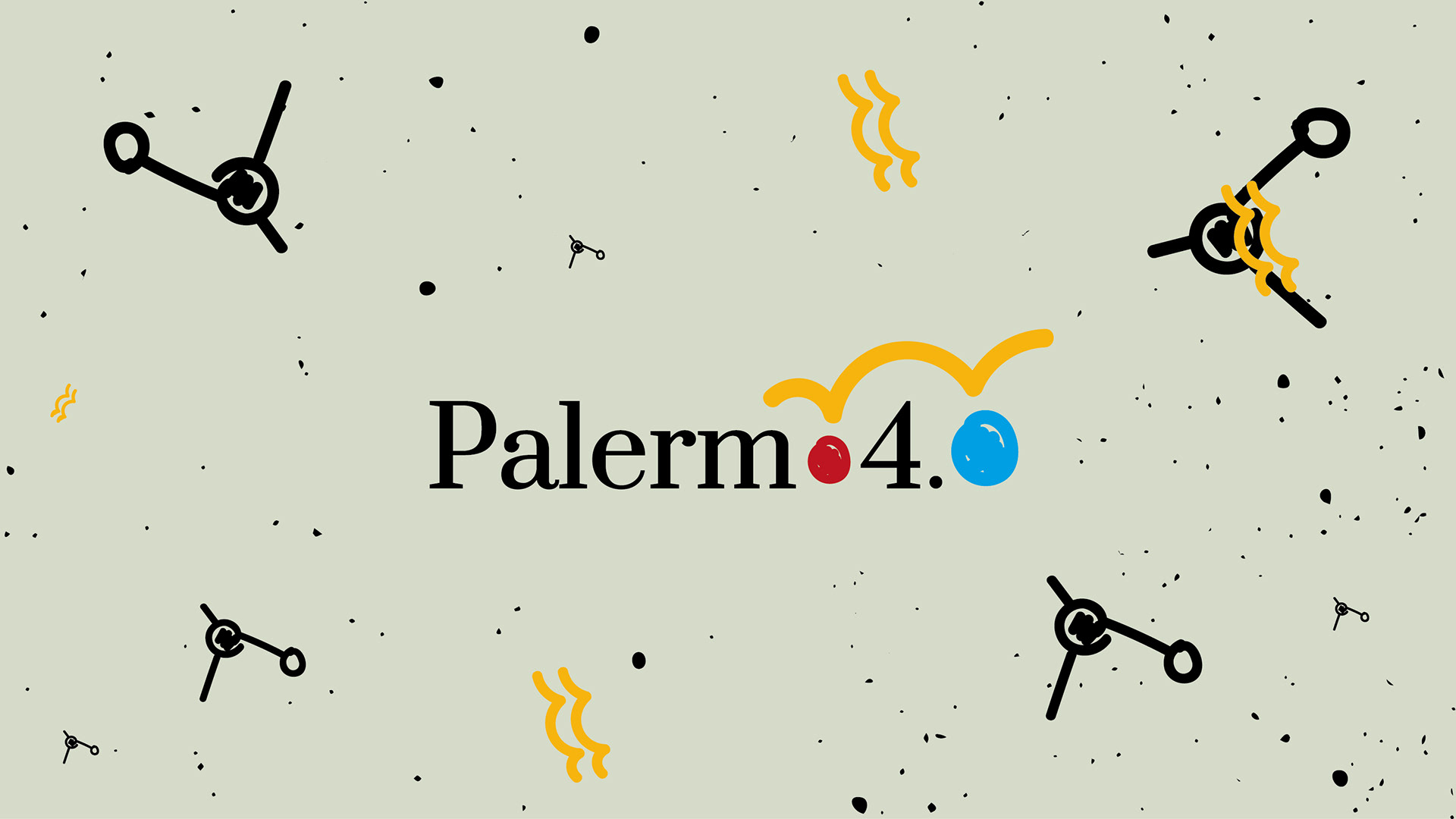
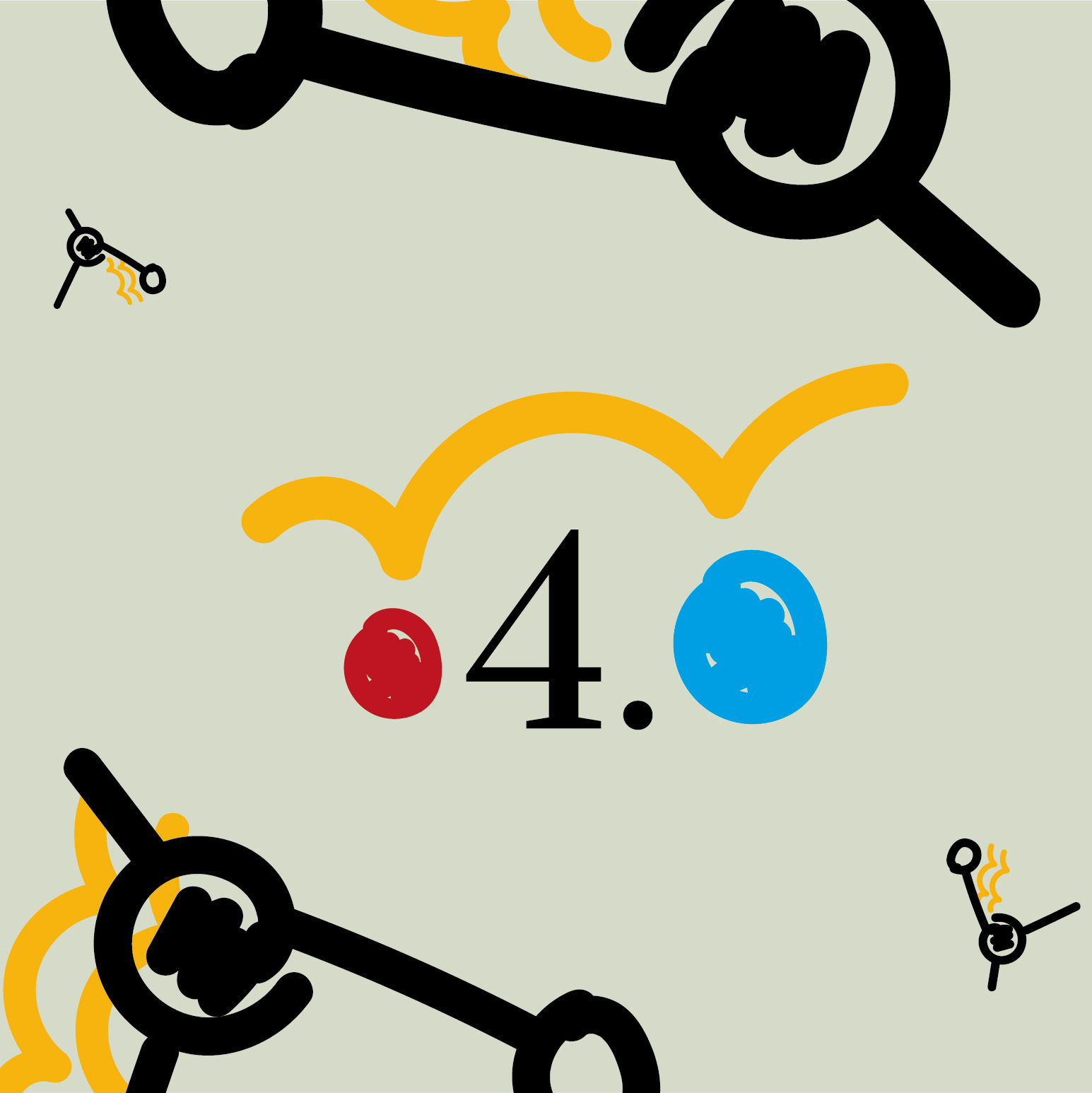
Palermo4.0 identity is born from the idea of connection. The Serif Font indeed is linked with the idea of jumping and "bridging" from one point to another. The will is to communicate a crucial moment in the life of the students. The colors indeed unite school, technology (job), and the colors of the Land. In conclusion, thanks to the Atomic Design, the logo is capable to be accompanied by different graphic elements for other communication products and doesn't lose the re-eligibility.
Born in the Covid-19 Pandemic the project is thought to link the students and the work in a difficult city environment like Palermo.
Digital Content & Social media graphic
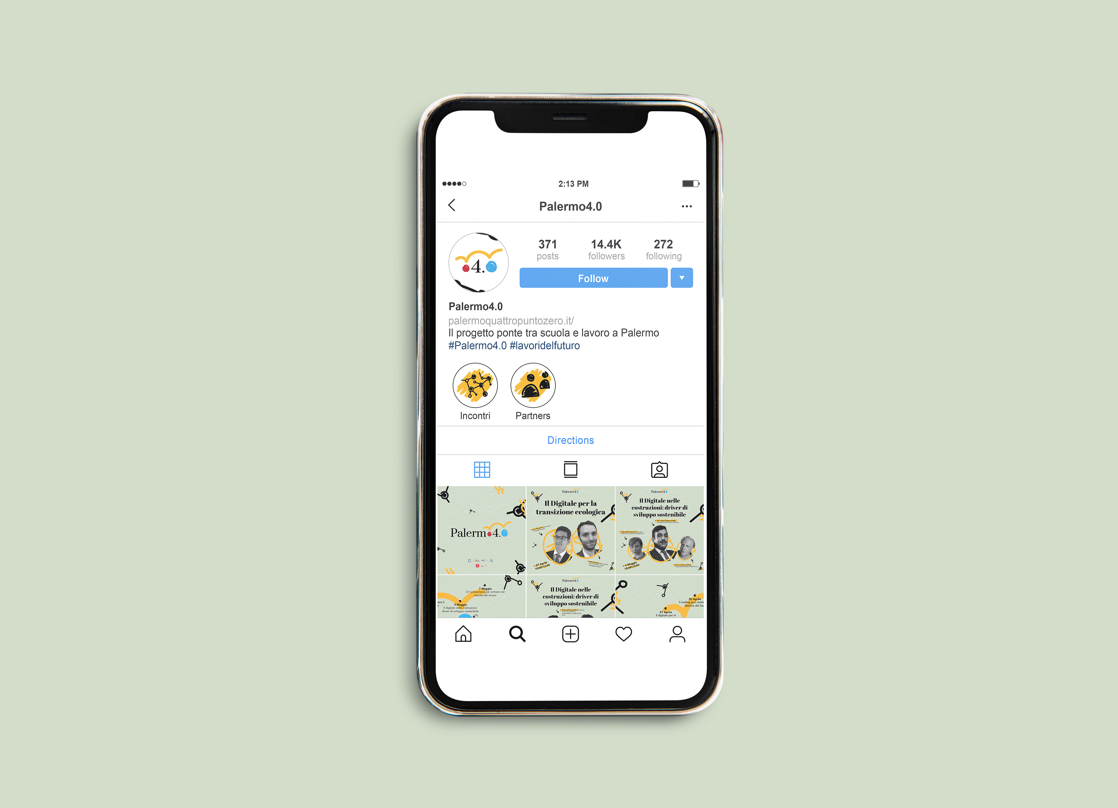
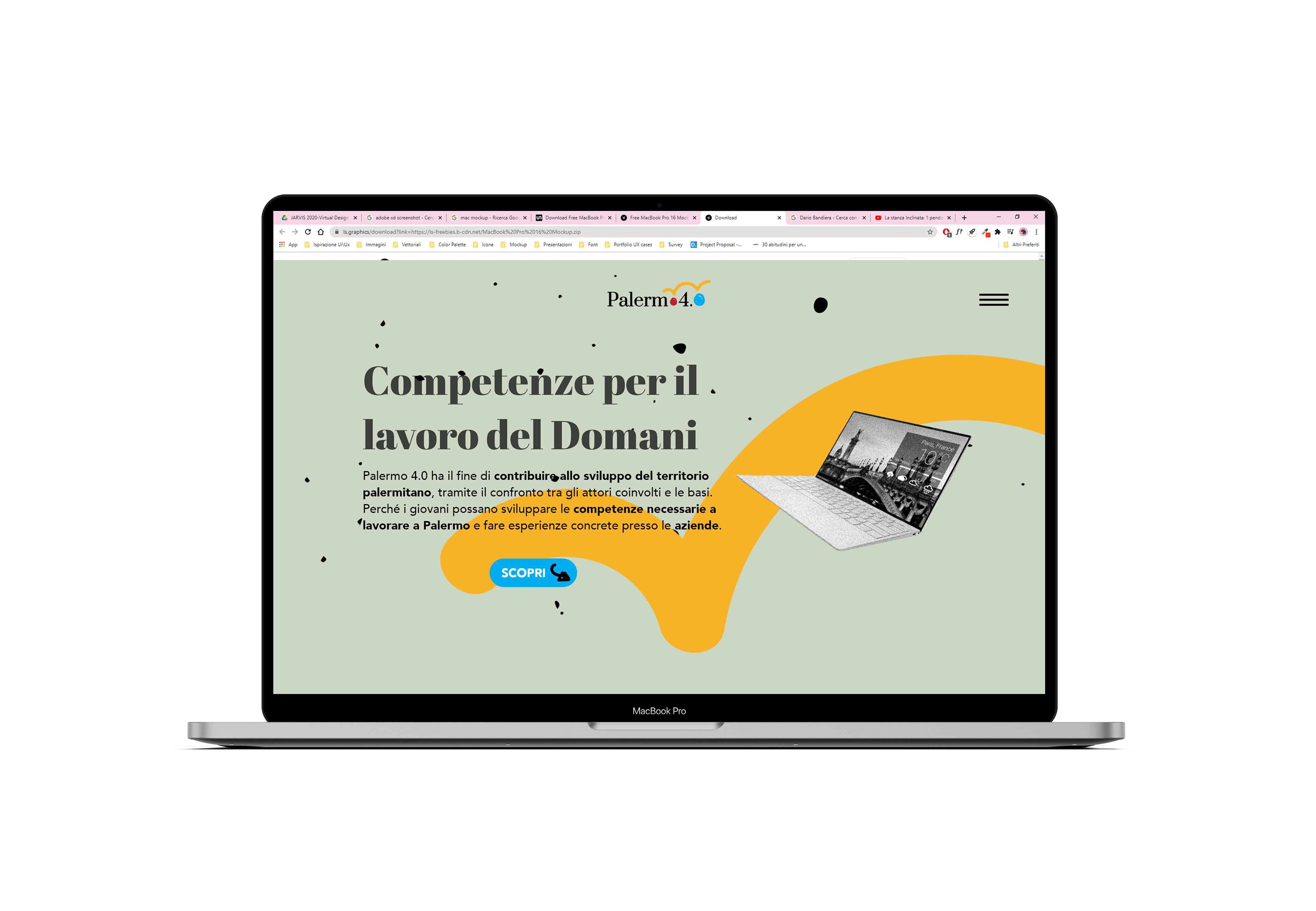
The project presents different multimedia contents followed by images of the logotype. Indeed, the contents are made by the same shapes, colors, and fonts as the principal branding image. The contents are based on the different events and meetings of the initiative.
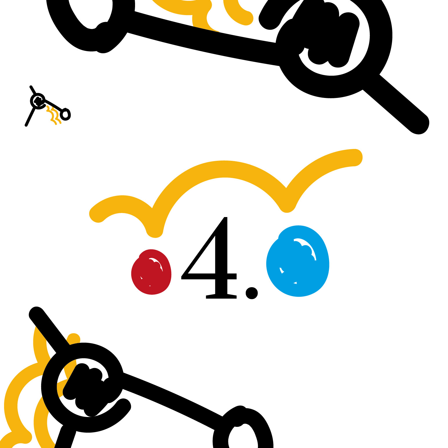
Palermo4.0's identity unites figuratively the world of the school and the work. The graphic wants to communicate meanings such as bridge, jump, and network. Indeed the shapes and the colors are made to be attractive to a wide range of ages.